Radiant
Solo Project
Timeline
7 Weeks
Tools Used
Figma, Notion, Typeform
A wellness app that empowers patients to monitor the progression of their symptoms alongside their mental health.
Discovery
Chronic illness is a never ending battle that affects one’s health and quality of life.
60%
US ADULTS HAVE A CHRONIC CONDITION
40%
US ADULTS HAVE MORE THAN ONE CHRONIC CONDITION
Data provided by Centers for Disease Control and Prevention (CDC)Design Process
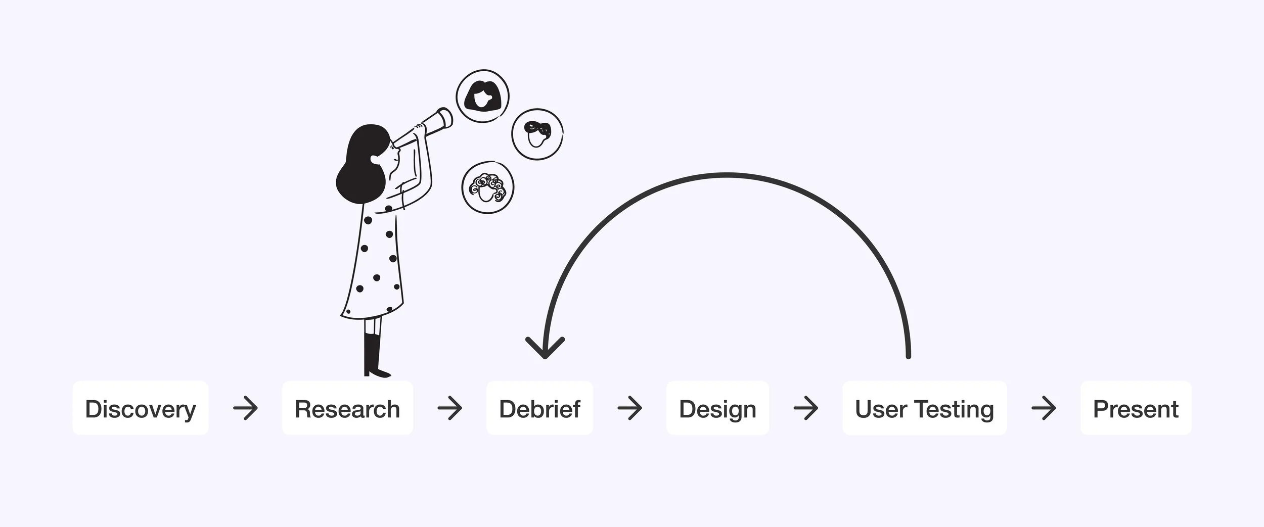
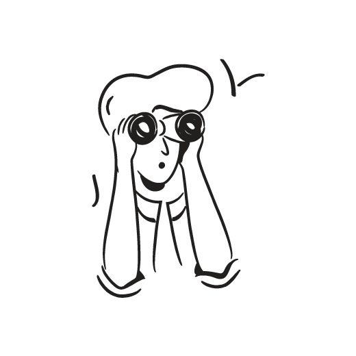
Research
When working on Radiant, I wanted to get a deeper grasp of chronic illnesses, the people dealing with them, and the issues they face.
By digging into competitive analysis, chatting with users, and usability testing, I aimed to understand the following goals.
Goal 01
Learn the common activities required to maintain a chronic illness. (e.g. medication, food, exercise).
Goal 02
Understand how patients currently track their medication and other factors required to maintain their symptoms.
Goal 03
Examine the tools currently used by patients and identify any features that might be absent in those tools.
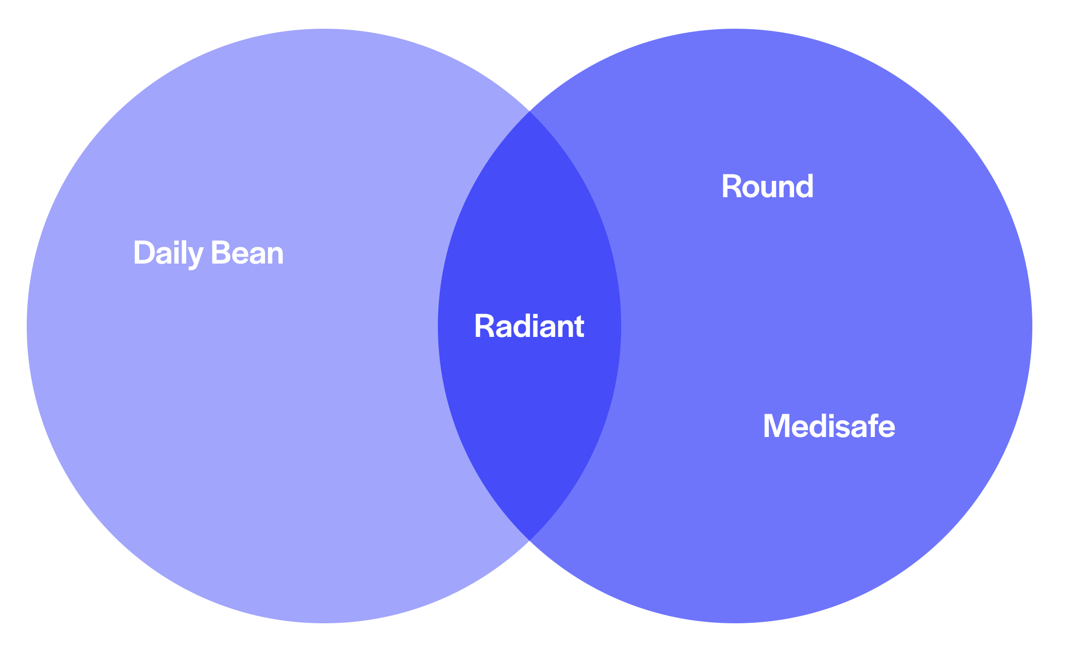
Competitive Analysis
To start my research, I scoped out other companies that were great at keeping tabs on medication or daily activities.
Findings 01
Medisafe & Round were excellent medication trackers but lacked tracking and data visualization.
Findings 02
DailyBean was a great daily tracking solution with data visualization but lacked the medical background that Medisafe & Round had.
Findings 03
None of the competitors had a goal tracking feature for users to understand their progress.
User Research
I interviewed chronic illness patients in the age range 20-60 to better understand their daily routines and pain points.
20%
Patients used a medication reminder.
100%
Patients said their illness affected their mental health.
80%
Patients had goals for their symptoms.
10%
Patients were tracking their mental health.
Research Insights
I gathered all my research and boiled it down to four key insights that consistently popped up in both the initial research and user interviews.
1
Individuals with chronic illnesses often have a strict routine to manage their illness.
2
Chronic illnesses affects one’s mental health.
3
Individuals who want to manage their chronic illness often set goals.
4
Some participants used a medication tracker but some features were lacking.
Problem Statement
How might we improve the lives of individuals with chronic illnesses?
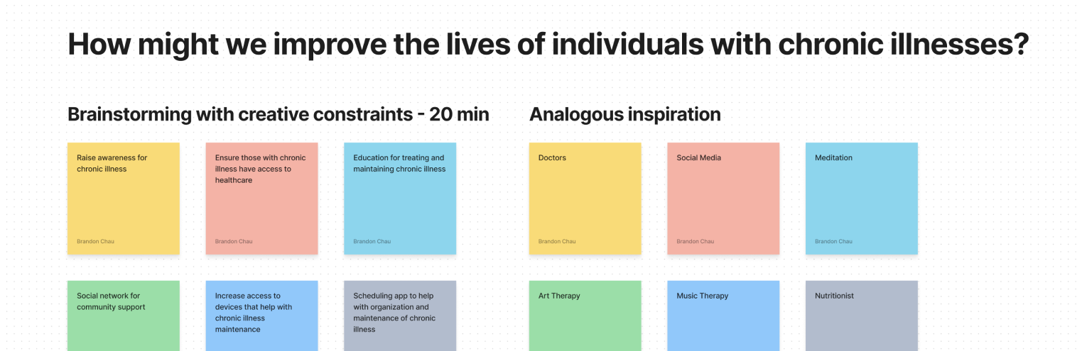
Ideation
I started to ideate solutions that could address the four key insights I made during the research phase.
I narrowed it down to three essential features that my tool needed to meet the needs of patients.
A way to track and remind medication.
A way to input data relating to a patient’s symptom and mood levels
A way to track and visually compare all the data inputted.
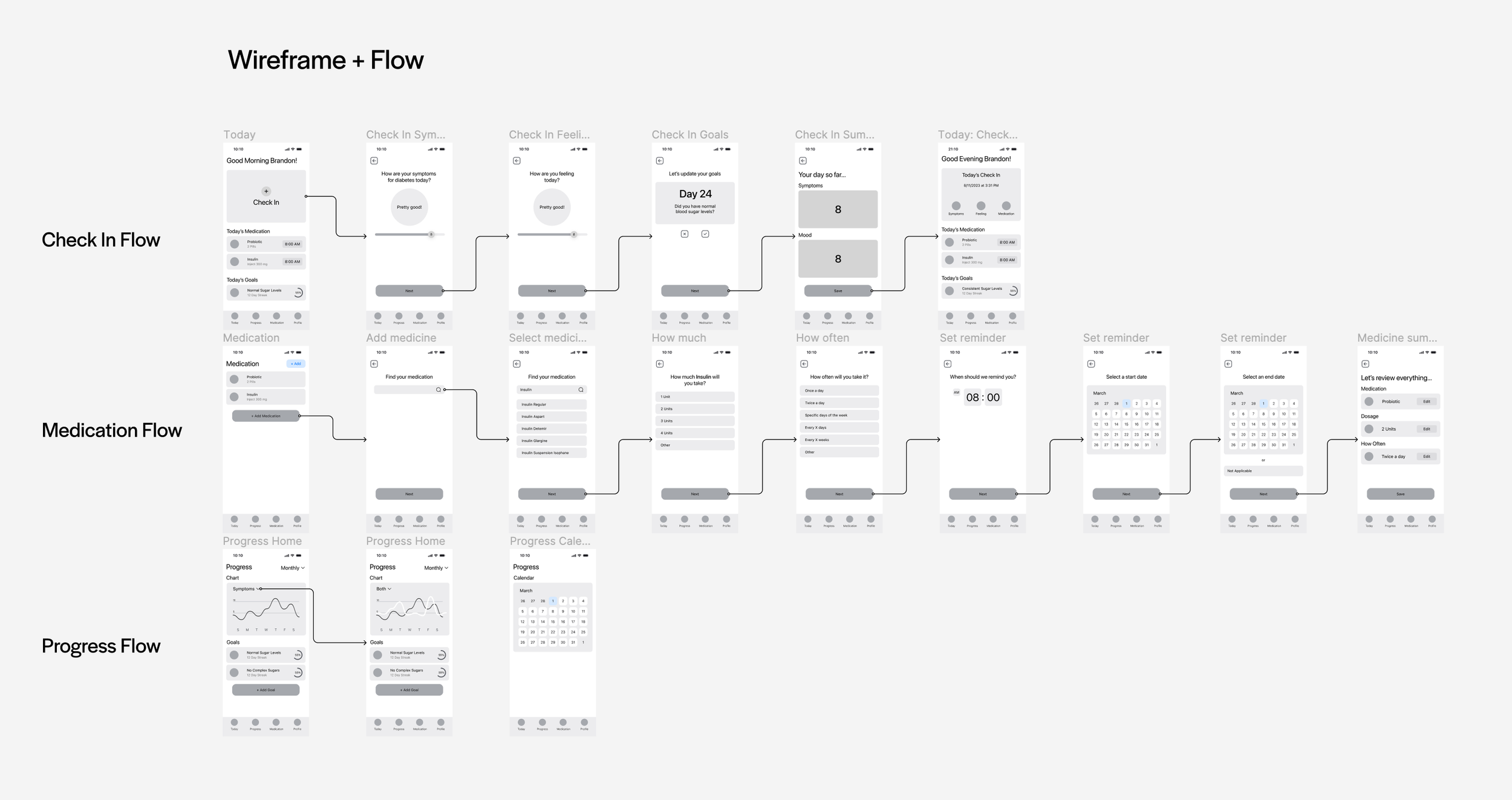
User Flows
I wanted to keep the app structure fairly simple so I created four key sections; Today, Progress, Medication, and Profile to house the key features.
Low Fidelity Sketching
With the patient needs and key features in mind, I sketched out a low fidelity flow for Today, Progress, & Medication.
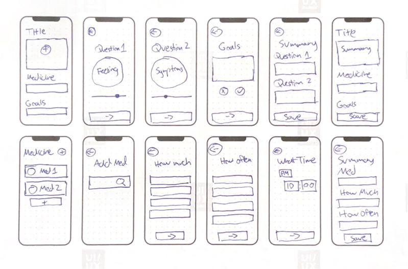
I’m a fan of physical prototyping so I started off by sketching high level flows on grid paper and then dug deeper for screens I wanted to iterate different versions.
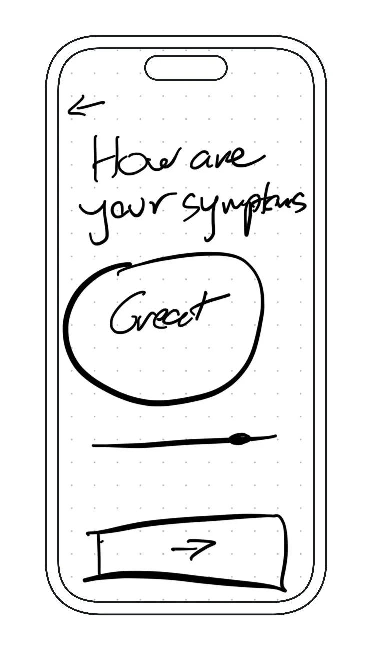
Slider Symptom Select
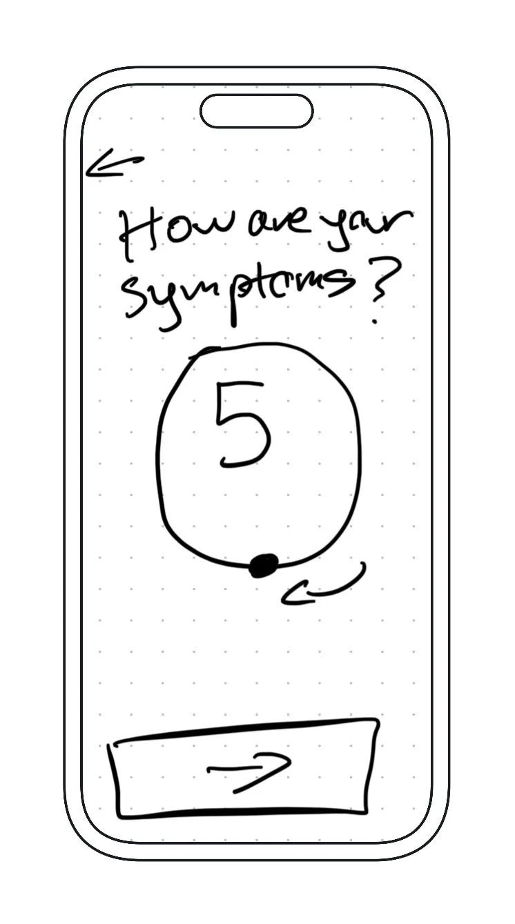
Circle Drag Symptom Select
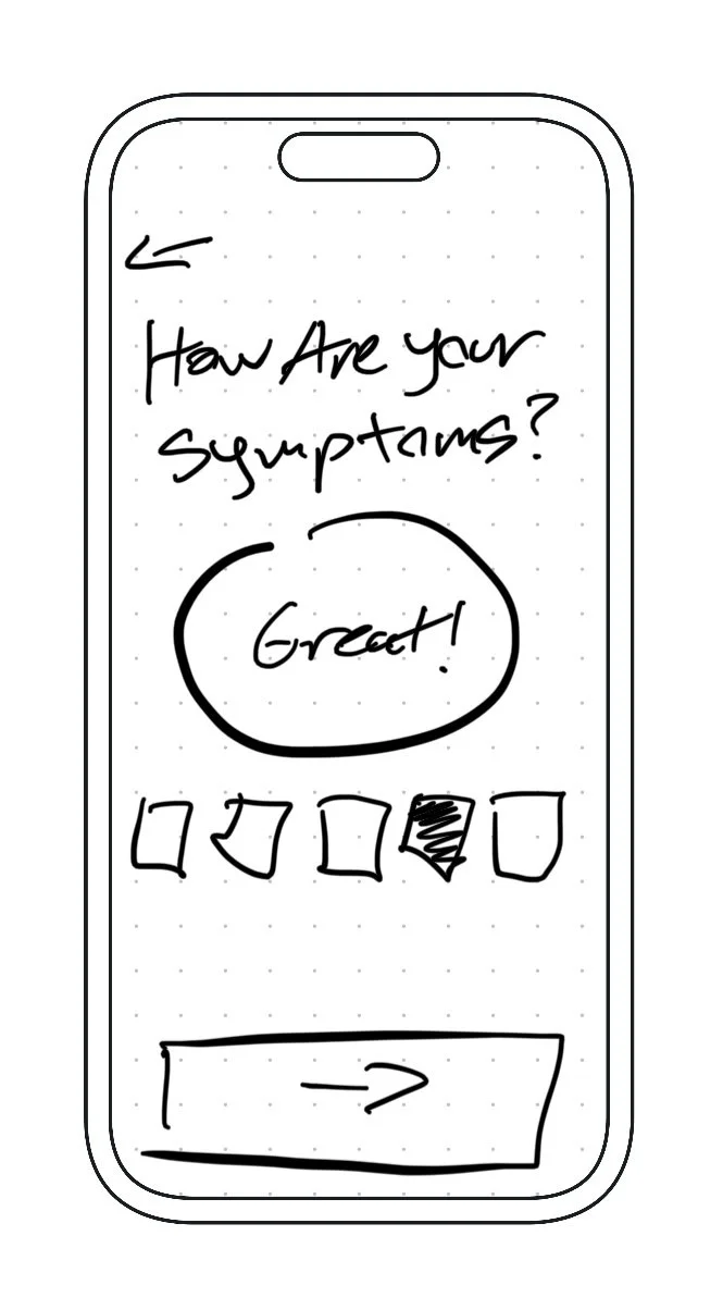
Number Symptom Select
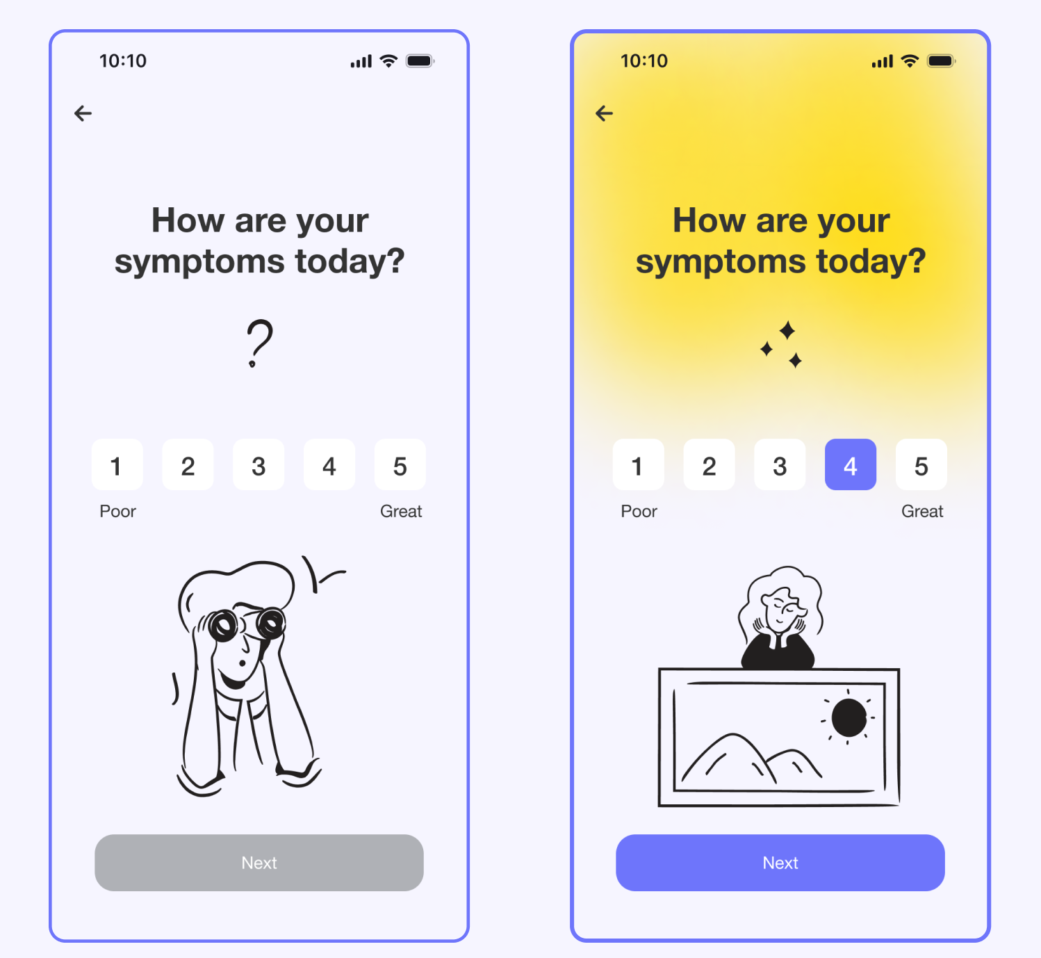
I experimented with different ways to choose symptom levels. My aim was to make it easy to pick while also making it quantifiable for tracking progress in the app's 'progress' section.
Mid Fidelity Prototype
My overall vision starting coming together once I created the mid fidelity prototype.
Test & Iterations
I tested my high fidelity designs with 10 participants, age 20-60. But this time, I didn't make chronic illness a necessary condition.
Everyone found my solution pretty user-friendly and easy to grasp. Although, some participants did point out a few parts that weren't super clear right off the bat.
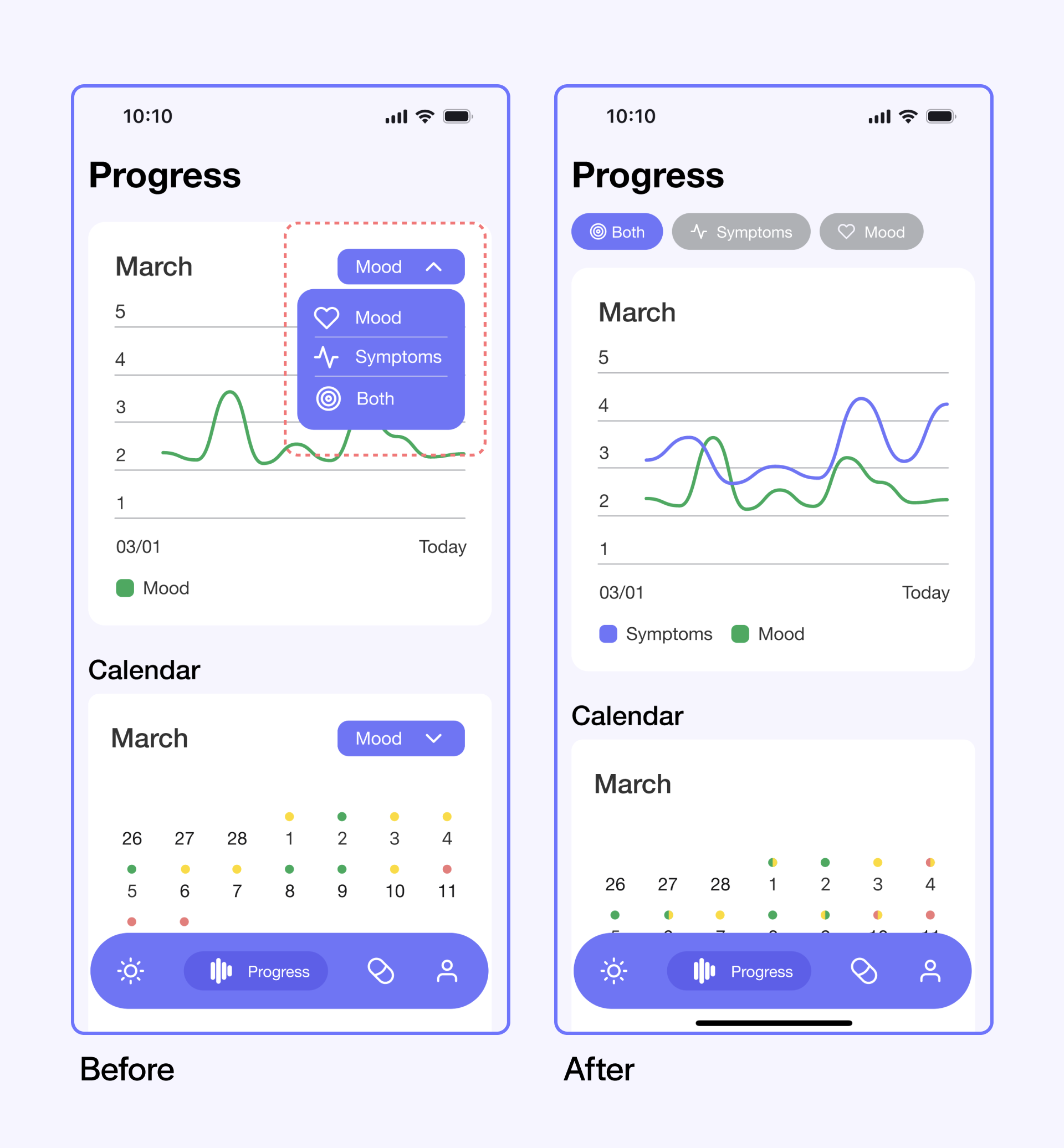
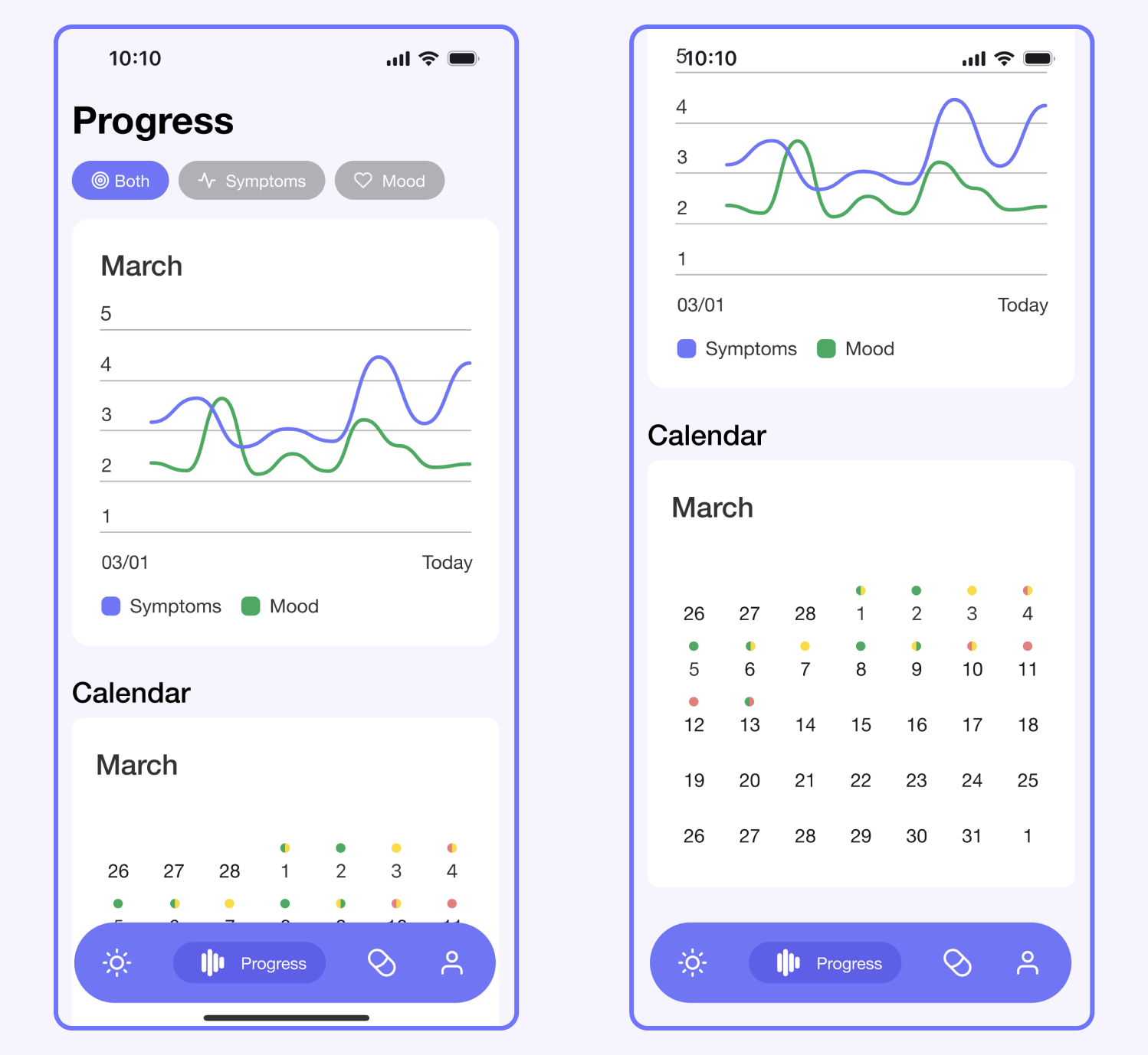
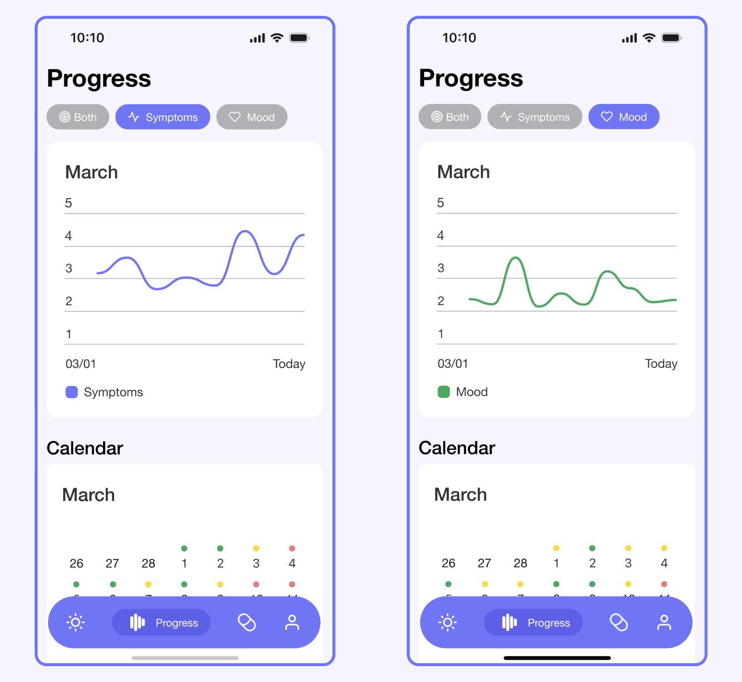
Progress tracker default filter
The filter for the progress was initially defaulted to symptom levels but patients preferred the both options to be the default.
Updates
Relocated the filters to the top of the page and set the default filtering option to ‘Both’ so that patients could instantly compare their progress.
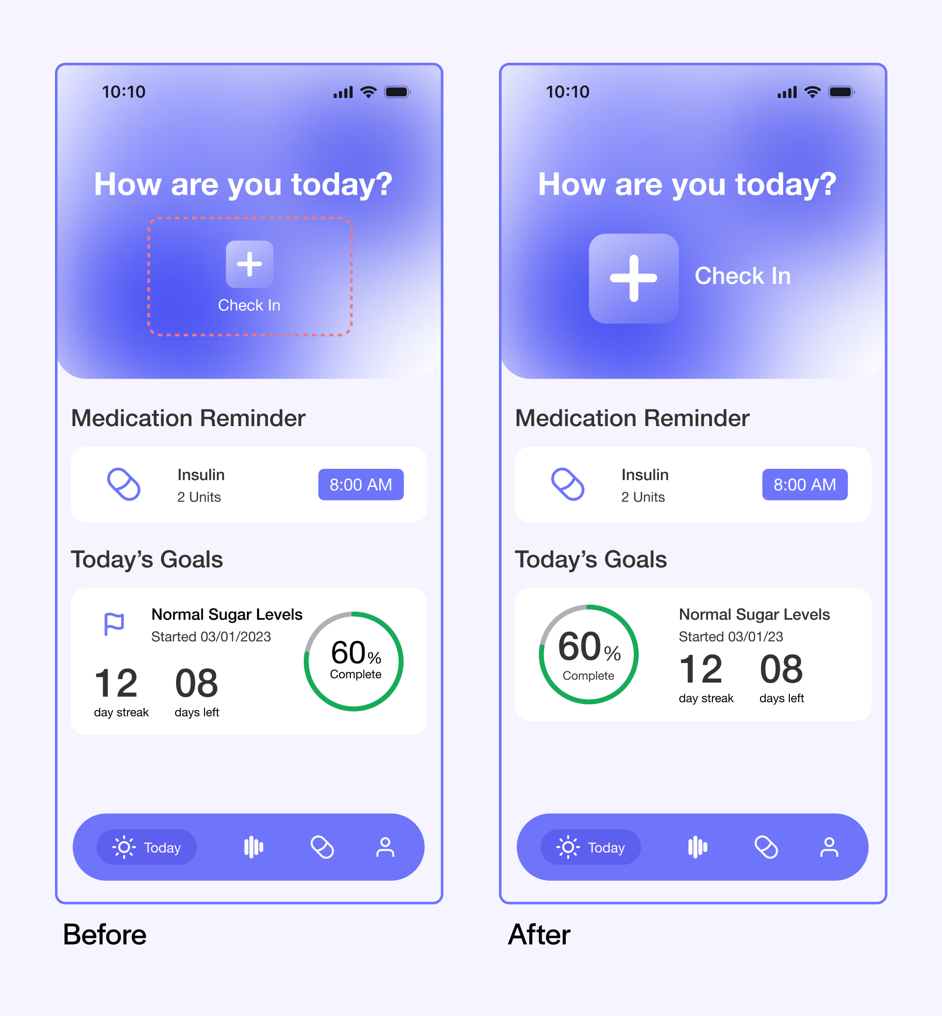
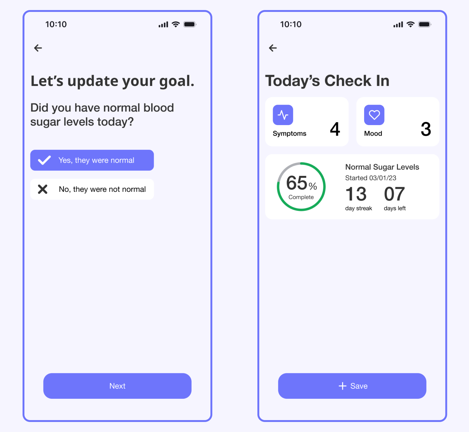
Check-In call to action
Patients did not find the check-in call to action easily.
Updates
Enlarged the check-in call to action and shifted the copy right.
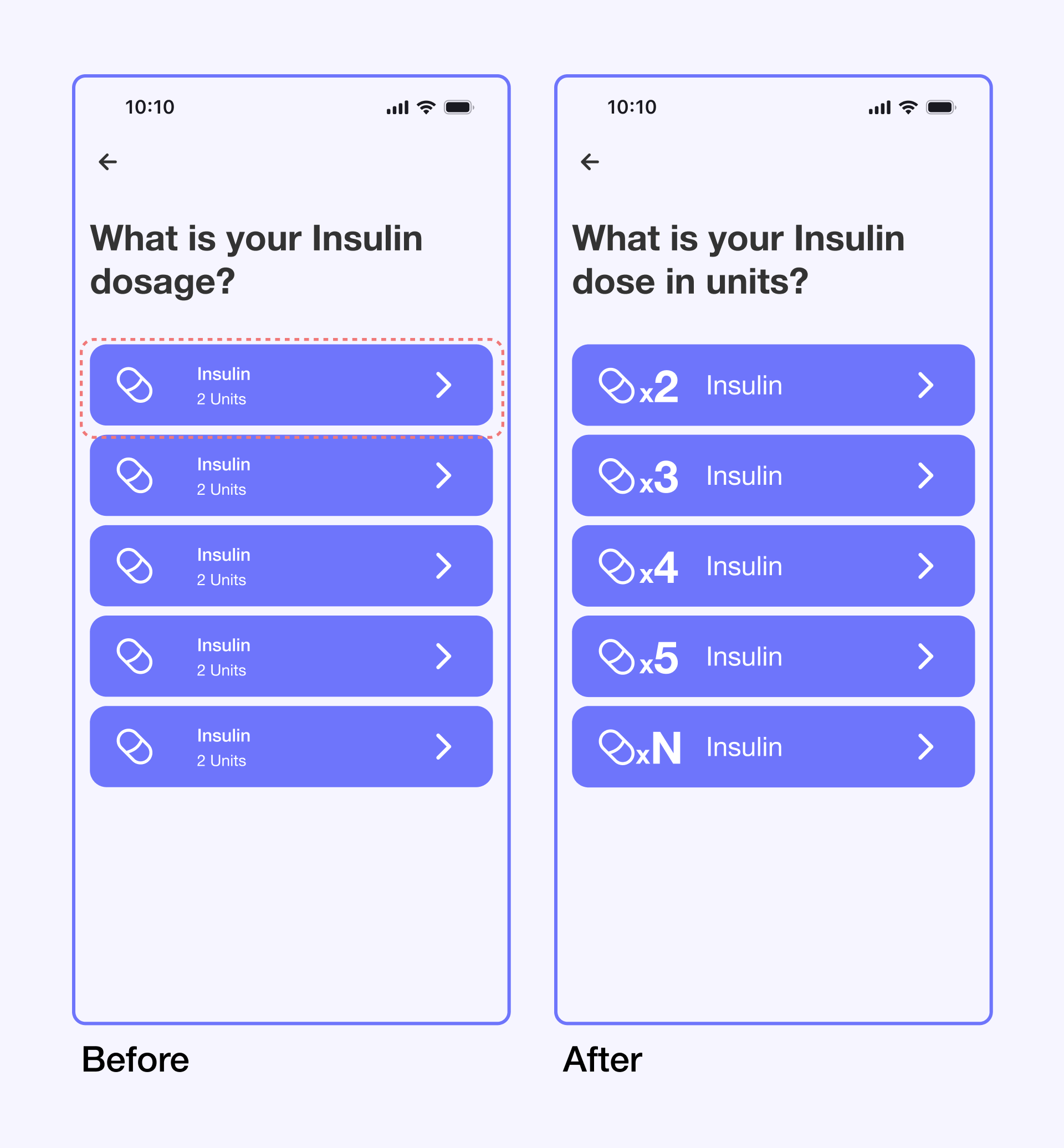
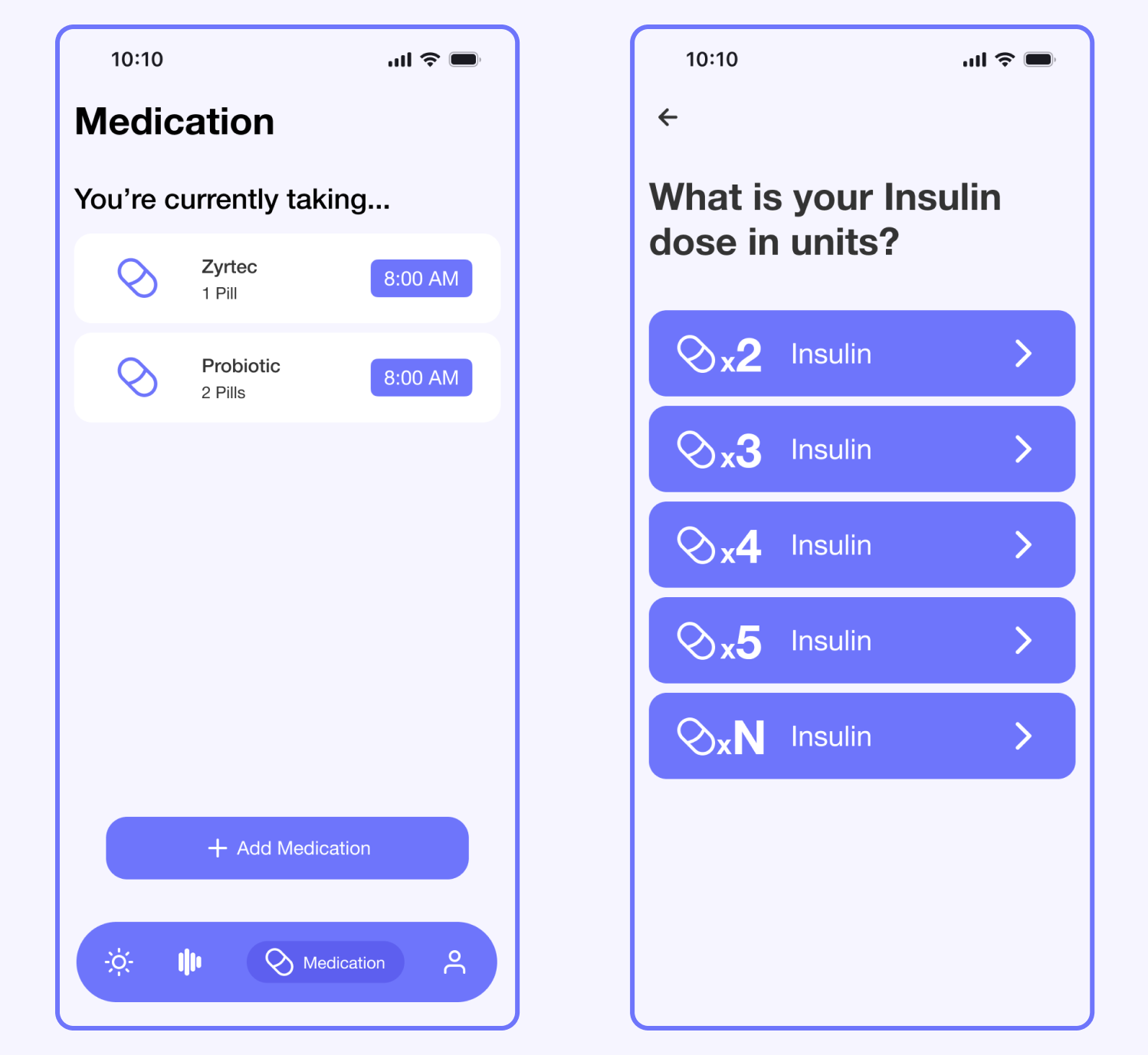
Medication dose language
Selecting a medicine’s dose was not immediately obvious.
Updates
Linked the number of doses directly to the pill icon, making it easy for patients to quickly understand the connections between them.
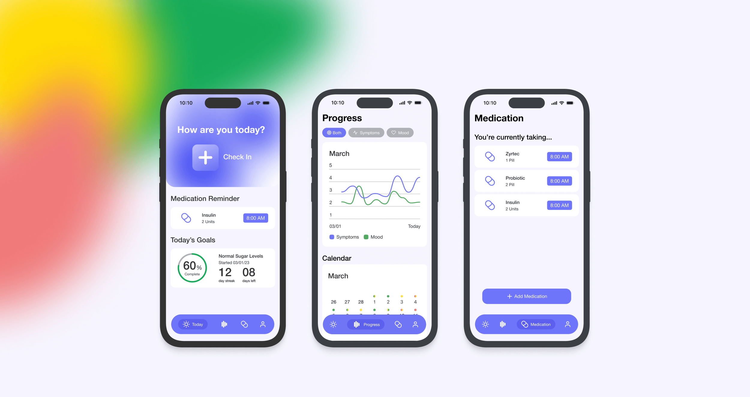
Final Designs
Check-in Daily
Update and track how your symptoms, mood, and goals are for the day.
Track your progress
Discover patterns in the symptoms and feelings you've shared.
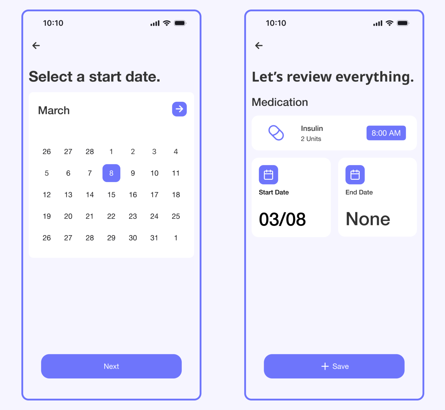
Medication List
Add new medication to track and set reminders.
Prototype
Learnings
The research part of this case study was the biggest hurdle. Talking about chronic illness and mental health can be tough, so I had to take some time to connect with my participants.
Overall, I was pretty happy with the feedback I received. Many patients found Radiant to be easy to use & potentially helpful.
If given more time, I would have continued to build out other progress tracking features to potentially integrate with wearable devices.
View other projects