Somatic
Timeline
7 weeks
Tools Used
Figma, Notion, Zoom
Solo Project
Designing a mobile inspiration search engine that promotes offline reference gathering and fosters collaboration.
The problem with research today
Creative research is bland and a chore.
When searching for references and research materials, we often get lost in the endless scroll of the internet. Finding inspiration can sometimes be tedious and an isolated effort.
In what ways can we redesign the creative research experience to encourage physical engagement and foster collaboration?

What issues do researchers face today?
Understanding the creative process
For initial research, I interviewed a series of creatives who research and build vision boards as part of their workflow.
Digital Burnout
Since many creatives already spend a significant amount of time in front of screens, they often seek inspiration by stepping outside.

Receiving Feedback
For collaborative projects, early feedback proved crucial in refining the overall vision before proceeding to the execution phase.

Singular focus
Viewing with intention
To start off my ideation, I wanted to have researchers view the content with focus instead of mindlessly scrolling.
This is where I decided to reference dating apps design patterns. Dating apps exemplify a single-action design pattern, where swiping through profiles focuses on one individual at a time.

Content Diversity
Switching up the content
Many platforms display videos and images as their main form of content but we can definitely improve upon that.
By displaying local events we can get our researchers up and out of their seats to find new content.
Published written content are well established and display trusted information on a topic.


Images

Videos

Articles

Events
Key Features
Defining the MVP
With the initial research and brainstorm complete. Things were finally coming together when I started prioritizing what features I needed for my V1.

Feature Priority
Must Haves
The core set of features I would need to design.
Nice to haves
Additional features that build on top of the core feature set.
Can come later
Cool ideas that can further flushed out after the MVP is done.
Swiper, Yes Swiping
Mapping out the interactions
I knew I wanted to utilize swiping motion to browse content but what should each swipe mean?

I finally settled on three main actions to interface with the content.
Swipe Left ← Browse new content
Swipe Right → Like content but not save
Swipe Up ↑ Save content to a project

Putting it in front of people
Testing the swipe interactions
With a mid fidelity fully built out, I decided to conduct initial user testing with several creatives to get their thoughts on the swiping interaction and other core features.
While the swiping content and other features received positive feedback, the upward swiping motion was frequently being misinterpreted as a means to access new content.
Expected this
Got this instead
Design pattern indecision
Introducing new design patterns
With so much confusion around the upward swiping I decided to take a step back and conduct secondary research.
After taking a look, it came to my attention upward swiping in today’s most popular apps always resulted in a snappy display of new content.

Exploration 01
Simplifying the mechanics
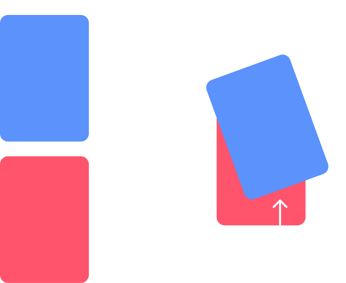
At first, I intended the right swipe to convey 'I like this content but not enough to save it' for the recommendation algorithm.
However, considering technological advancements and interest indicators like impressions, watch time, and read time, I opted to simplify the swiping mechanism to just left and right.

Display new content
Save Content

Exploration 02
Media card interface
I originally designed the media cards to be simple content for quick saving. But after user feedback and some further iterations, I decided the media cards should have additional utility and highlight the media type it’s displaying.


Component iterations
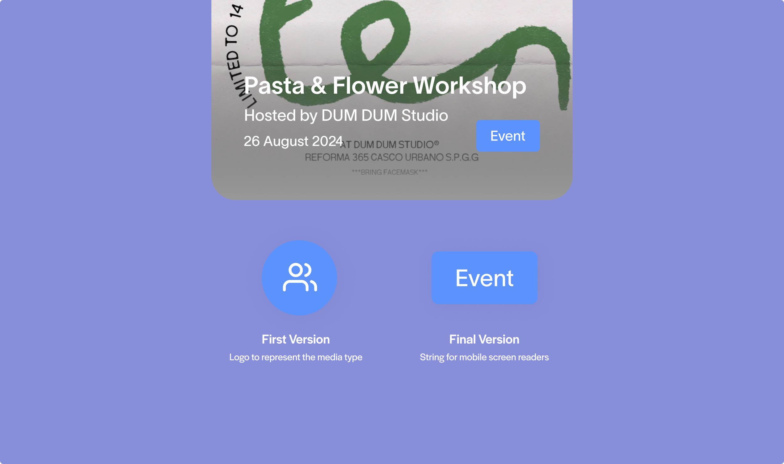
Media label design
Initially I wanted a simple media label where viewers could identify the media type based on the logo. At the same time, I also wanted to ensure all components were abiding by accessibility standards.

Media card iteration
The first version of the Somatic media card was very simple. Researchers could tap on ‘Info’ and the card would flip to display info about the card. After user testing, many participants requested for upfront context and more actionable card features.
In the end, I decided to make the media label a simple string so that mobile screen readers could interpret the media type for viewers. The final version specifies the media type without relying on color and imagery.
During my revisions of the card, I decided to rethink the information architecture and make the cards a little more useful. I brought the card information to the front and introduced card specific features on the back side.
For example, if it was an event type card then researchers could RSVP to that event.
Exploration 03
Swipe education

To top off the overall design experience, I wanted to make sure researchers understood how to navigate Somatic’s core functionality. This meant including signifiers on the media cards and a proper onboarding experience.
Swiping left ← will bring up the ‘Next’ label to indicate new content will be displayed.

Swiping right → will bring up the ‘Save’ label to indicate the current content will be saved.
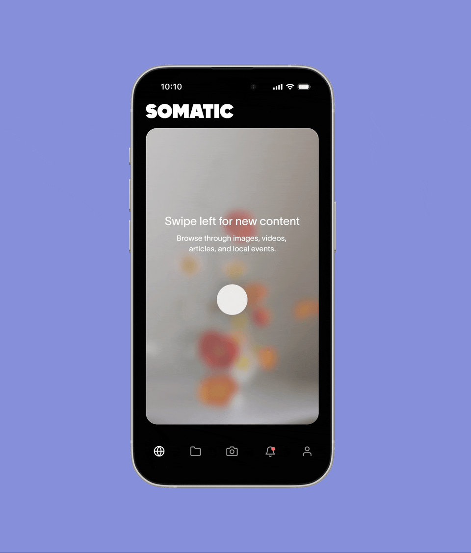
Onboarding
By leveraging visuals as the primary learning method, I designed an onboarding flow to help researchers explore content and navigate through the Somatic app.
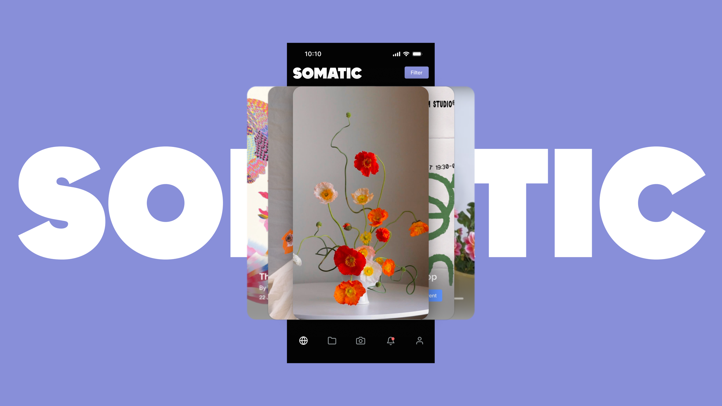
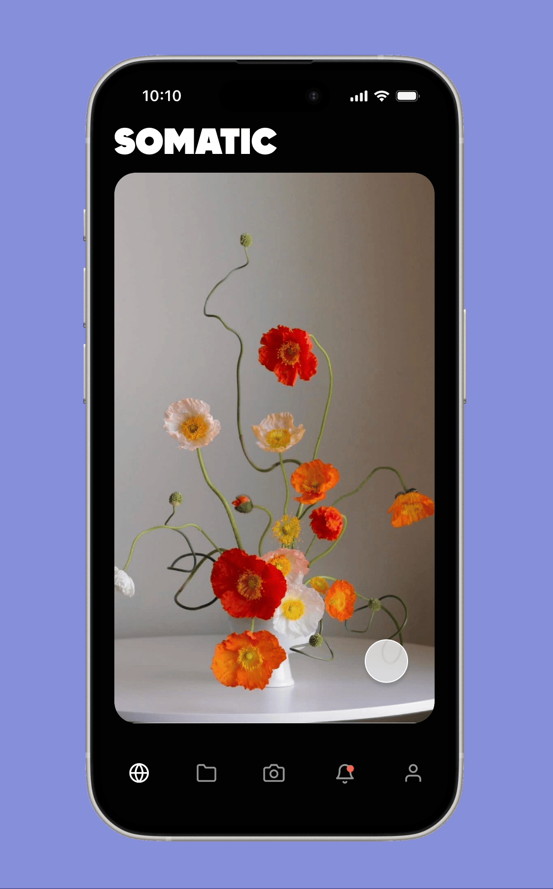
SOMATIC
SOMATIC
Swipe Right
➞
Swipe Right ➞
Swipe Left
←
Swipe Left ←
Onboarding
Say hello to Somatic
Introducing creatives a new way to discover and collect inspiration.
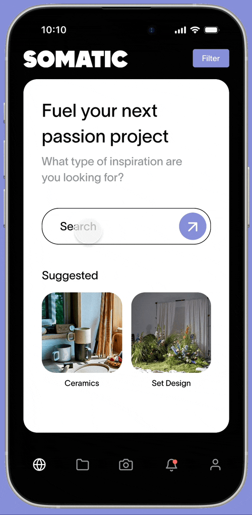
Research
The Search Engine
Discover references differently. Swipe left ← to explore various content formats related to your query. Swipe right → to save in a project and refine your vision.
Digital & Physical
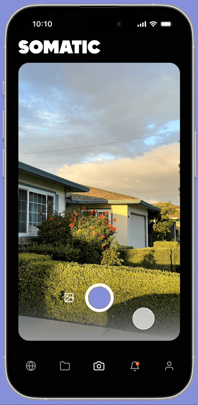
Capture Content IRL
Explore local events aligned with your interests, capture what inspires you, and add it to your expanding project reference collection.
Cohesive vision
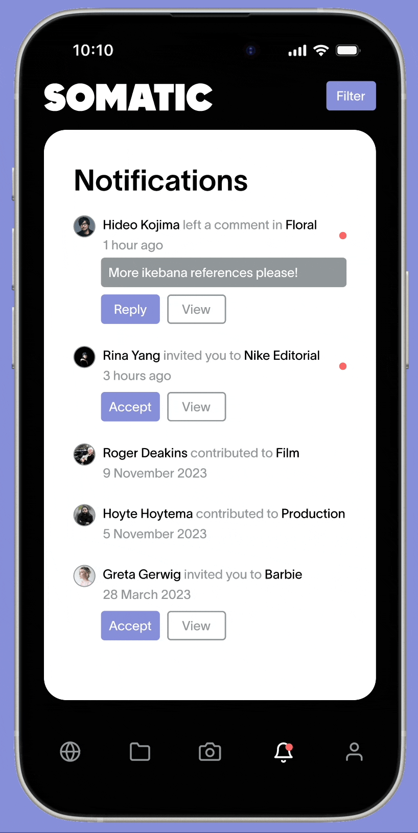
Collaborate and give feedback
Collect, share and receive feedback on the project references within Somatic. Teammates can comment on your projects and invite you to their projects for constructive feedback.
Final Prototype
Conclusion
Learnings
Utilize existing design patterns
It was an internal struggle to try to introduce a new design pattern for displaying content. On one hand, I wanted to introduce something new but on the other hand people were already acclimated to existing design patterns.
Balancing the desire for innovation with user familiarity taught me the importance of sometimes adhering to existing design patterns rather than attempting to change user habits. Maybe on a future project!

View other projects